Value of Paper and Print
Method
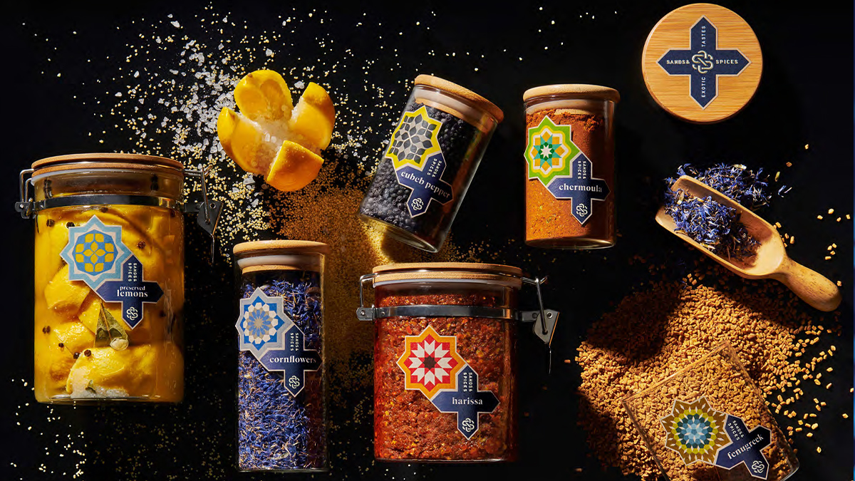
Spicers drew inspiration from the styles and aesthetics of Morocco, creating labels that resembled the colourful and intricate tiles of a Marrakesh Bazaar and desert sand. The labels were printed on premium recycled paper including 30% post-consumer fibres and were created using a Hot Foil & Embossing Tool allowing for the punch of embossing. The gloss ceramic tile look was achieved through the screen used. The label was designed with its own narrative, explaining the print applications, techniques and embellishments to each customer and providing a Design, Print and Application Guide, elaborating on these key factors and the role they play in delivering the best outcome for label performance.
The results
The piece was well received by designers who appreciated the process and method put into creating the label. It also saw industry commendation winning Spicers the Silver Award in the Food Category at the annual packaging design competition Pentawards.
Download this ready-designed PDF to access the full case study. VoPP gives you our blessing to use or rebrand the content to help you communicate the value of paper and print now.


 Subscribe to VoPP